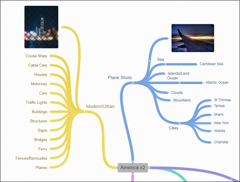
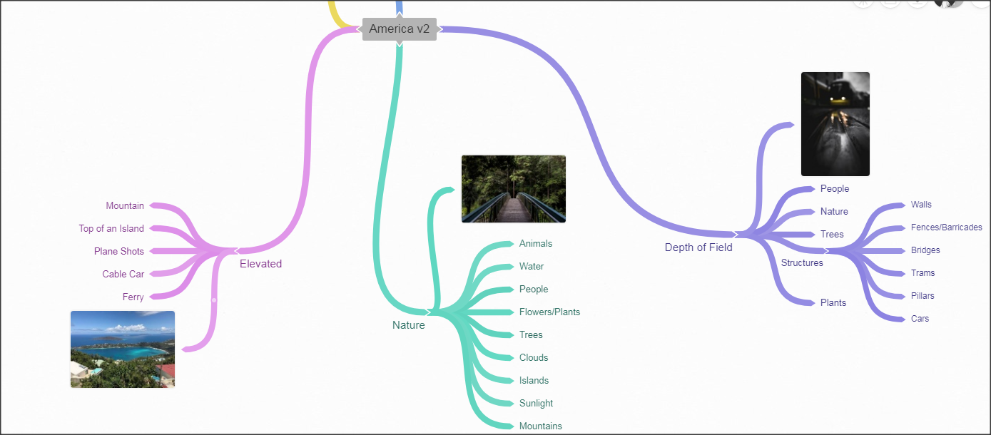
Statement of Intent
Project Theme: Landscape
I aim to create a sketchbook to show off, all of my Photography work I have taken in Manchester and up to 4,300 miles away on the South East Coast of the United States of America. The theme of 'Landscape' will be used in my GCSE exam in January 2020, I will present my best photographs taken over a 3 year span, to try and achieved the best grade possible, a 9. I wish to produce a highly developed page, which clearly shows my progress and the journey I have taken with my work.
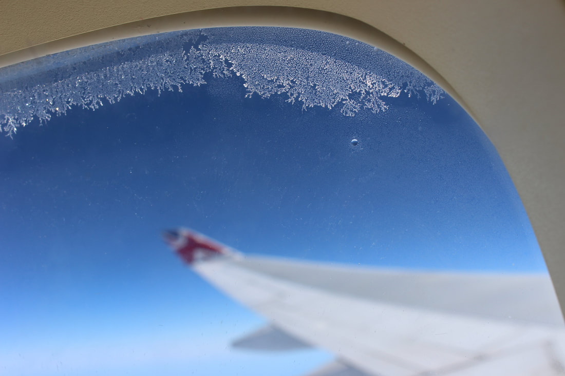
For this I will mainly be focusing on out of car window/plane window photography. It can portray a sense of trapped/inescapable feeling that causes the image to become alive. I'm looking at Photographers such as: Kenn Tam, Lee Friedlander, Marco Britto and Jarrad Seng. Those Photographers used techniques such as; lighting, Depth of Field, reflection, Rule of thirds and a plethora of advanced techniques they've mastered to create the perfect image. I believe my images, in a way look similar or possess similar properties, in terms of the style. I am also focusing on 'clouds' and 'buildings', or both. There are various Photographers who create work to cater my style: Regina Geoghan, Jisu Han, Bogdan Pasca, Vaishnavi Giri and Nitin Sharma. My last potential focus is on 'street signs and traffic lights'. Some Street Photographers consist of: David Gardener and Mark Broyer
When I chose this theme, my initial research was of Window Photography, Cloud Photography, Building Photography, Street Signs and Traffic Lights Photography. There are most definitely more opportunity down the Man-Made Route such as, Buildings, Street Signs and Traffic Lights. As a vast majority of my images are taken within urban areas such as; Manchester, Atlanta, Tampa, Miami and Charlotte. I am very confident as to the level of work I am going to produce. Ultimately, my initial themes are Man-made, urban areas. This causes my work to be mainly focused on colours and edges as well as the sharpness of the image.
Equipment wise, I am very fortunate to have parents in the creative industry, it allows me to have access to: tripods, cameras, sufficient SD cards and a variety of different lenses. It allows my shoots to look more professional/presentable, especially with the use of Tripods and a different lenses. It allows me to capture images, exactly how I want it to be from distinct detail, to rain droplets being captured via shutter speed, to a deep depth of field. It makes any image possible, with an advance kit of equipment. As my work goes on, I show slow and slight progression, partly due to the understanding of my kit, and secondly due to the progression in skill and lastly the environments where most of my images are taken cause it to be very easy to capture an impressive image.
At the point in my work I am very confident with a various number of techniques and camera factual techniques/styles. I love using Depth of Field, Rule of Thirds and Shutter Speed. Depth of Field presents a sense of importance as something is highlighted through the image using focus, it can dismiss a percentage of the image and allow one sector to be far more important than the other. Rule of Thirds kind of segregates an image and yet again shows layers of importance and less relevance to the image. Shutter Speed is a very unique yet versatile, technique that can be used to capture many different types of images, but it's ultimately used to capture fast pace images that the human eye many or may not be able to fully track, for example, the movement of light, rain/water, athletes and even cars. My knowledge of previous analysis and photographers research will help me to show my understanding and thought process through the representation of words and art.
Mind Map Landscape
Artist Research
The Context
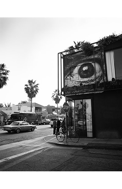
Los Angeles-based photographer Jessica Sample studied at Brown University, Rhode Island School of Design, and the International Center of Photography. Prior to her solo photography career, Sample acted as the Deputy Photo Editor of Travel + Leisure. In addition to Travel + Leisure, her long list of clients includes Condé Nast Traveler, National Geographic Traveler, Food and Wine, GQ, The Wall Street Journal, and Hemispheres, among others.
From- https://www.complex.com/style/2013/02/the-25-greatest-travel-photographers-right-now/jessica-sample
Composition
The main focus of the image, is the eye located in the middle of the image. This causes the image to look very detailed and exotic as, this vast eye is the main focus and possesses lots of detail. The eyes attracted me in as its surrounded by opposite shades such as black and white, it also has different shades within it causing it to stand out from the rest of the image. The perspective it is taken in is as if they're walking and or driving past. There's a plethora of shapes and lines within the image, this causes the image to look more advanced and make it look more alive. It causes me to feel warm and safe as everything is at peace, as everyone is living their loves peacefully. The sky also creates an element of travel and purity as it takes up a large amount of the image. The lighting in the image is quite difficult to tell, but the eye and cars has a reflection this shows it is light outside. The sky is also a very bright colour this portrays sunlight. The black wall creates contrast within the image as the rest is bleached out. This is quite a hard contrast as it goes from bright white to pitch black, this creates a sense of conflict within the image. The eye is taking up a third of the image this suggest importance and power. The positioning of the building also uses rule of thirds which causes the contrast to be more visible. Moreover, the sky has grand importance over the image, creating a more white/bleached out image and gratifying the contrast. The image causes people and cars to look extremely insignificant. The depth of field is very deep as you can see everything in the image even to the farthest point. This image used a standards lens with a narrow zoom, it would've been taken on a moving object/vehicle.
Content/Connection
The structure of the image consist of constant clash of dark & light and rule of thirds. It's an old image, I gathered this assumption by looking at the vehicles in the image. It was primary Black & White shades. The tropical trees suggest its in a tropical area, I think it's in Cuba due to the outdated cars and vibe of the image. There's plenty going on in this image, people living their everyday lives and the eye looking down on them. It leaves a message that life will always go on. It's mostly the eye as it is the centre piece of the image causes the biggest impact.
The theme of this image is travel photography in rural/tropical areas, this resinates with my work as during the summer I travelled to America and the Caribbean, therefore I have sufficient images to match the likes of this image. The image was most definitely taken out of a dormant vehicle/moving vehicle, just as mine were taken. It just suggest that life will go on as, even though the eye is there and very prominent, everyone is still around living their lives. I think the image is black and white to show the age which is further backed up by the older cars. I would definitely do this in my work.
Comment
I like the image for serval different reasons, I like hidden messages, the outgoing lack of colour, the composition, the sense of security: the list continues. Something I don't like about the image is there's too much sky, it just bleaches out the majority of the image. This is definitely influential as it has combined masses of different components to create this masterpiece.
The Content
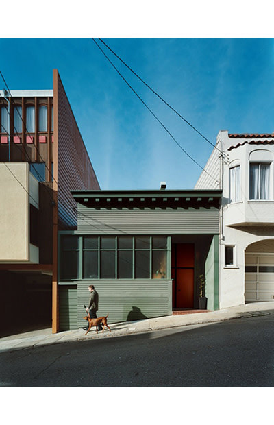
San Francisco-born, Los Angeles-raised Misha Gravenor has been interested in photography since his mom gave him his first camera, a Kodak box camera. After studying at the Art Center in Pasadena, Gravenor set his sights on a photography career, receiving accolades from PDN, Communication Arts, and American Photography. The food, travel, and portrait photographer has published work in Dwell and Bon Appetite, among other publications.
From- https://www.complex.com/style/2013/02/the-25-greatest-travel-photographers-right-now/jessica-sample
Composition
The focus point of this image is the green house in the middle, as this is a clear use of the Rule of Thirds. It's from the perspective of a normal person passing by. There are various sharp edges and leading lines, such as the electric wire above the house and the brown house on the left of the green one. The lighting in this image is obviously not direct as the shades are captured from an angle. The light would be coming from the opposite direction the man is walking from, this creates a soft contrast as the shadows aren't major factors of the image, but it's a nice gentle touch. The Rule of Thirds in this image is very strong and easily recognisable, as the house are all taking up around a 1/3 of the image. My eyes were almost immediately drawn to the man and dog walking in front of the house and the small shadow following it, the shadow being in the middle of the colour just stands out massively in comparison to the rest of the colours. There is a mass sense of scale as the Man and dog are perceived to be tiny in comparison to the houses in the image. There is no depth of field as I can clearly see every detail throughout the entire image. I personally believe this image is too straight to not be taken on a tripod, it was definitely set up in some type of way to cause the image to be more straight and professional.
Content/Connection
The structure of the image consist of a vast range of colours, shadows and an ongoing use of Rule of Thirds. This looks to be a rather modern image as the houses look more modernised and the use of electric wires. It as a plethora of bright, vibrant colours that allow the image to be perceived as happy and joyful, but also modern and advanced. I a not particularly sure where this image is taken, but it's in some modernised (probably American) city. There's one example of life in this image and that's the man and his dog. This shows that buildings/manmade entities are more superior than people. The houses in this image take up most of the frame and overlook the small insignificant man and his dog. The theme is manmade entities are greater than/more superior than nature. In my work I used the superiority of manmade objects to nature via bridges and planes.
Comment
This image possesses many strengths such as a wide range of outbursting colours a strong and vivid Rule of Thirds and a clear message, it also uses the simplicity to its advantage as it is simple yet effectively and eye catching. I like everything about the image from the composition and content to the simple nature, but yet beautiful and advanced. This image inspires me to create more simple, yet complicated images such as this.
Shoot 1- Dark, Motorway Cloud Shots (America v1)


Best Picture
I think this is the best image as,
It has a shallow depth of field mixed with a variety of bright, loud colours |
Worst Picture
I think this is the worst image as,
The trees passing by are quite blurred and the shot isn't straight |
Shoot 2- Bright, Vibrant White Cloud Shots(America v1)


Best Picture |
Worst Picture |

I think this is the best image as,
It has detail and definition on the cloud, allowing it to look more 3D |

I think this is the worst image as,
The cloud is too big and takes up most the image, the picture isn't straight and you can see the reflection off the car window |
Shoot 3- Airplane Shots(America v1)


Best Picture
I think this is the best image as,
It has a shallow depth of field and a vast variety of colours and shades |
Worst Picture
I think this is the worst image as,
The lighting is awful, it isn't focused and its not straight |
Shoot 4- Multicoloured, Hook Shaped Cloud Shots(America v1)


Photoshop Edits


This my very basic attempt at 'Layering' and creating an image via filters, duplicated layers and slight movements from around the primary focus of the image, in this case the red and orange burst of colour in the middle of the image, it is a simple technique but used professionally can make any image look advanced and sophisticated.
Best Picture
I think this is the best image as,
It has a Deep Depth of Field, it also has a nice colour range and the slight reflection in the rear view mirror |
Worst Picture
I think this is the worst image as,
Its not a bad image, just the others were better, with a better Depth of Field and more colour variation |
Shoot 5- Cruise Ship/High Up Cloud Shots(America v1)


Photoshop Edits
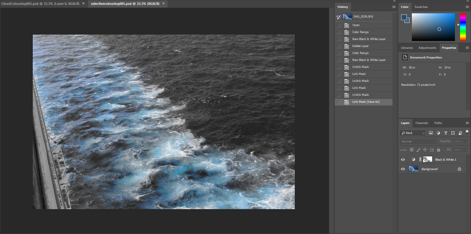
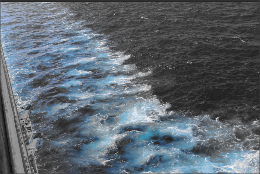
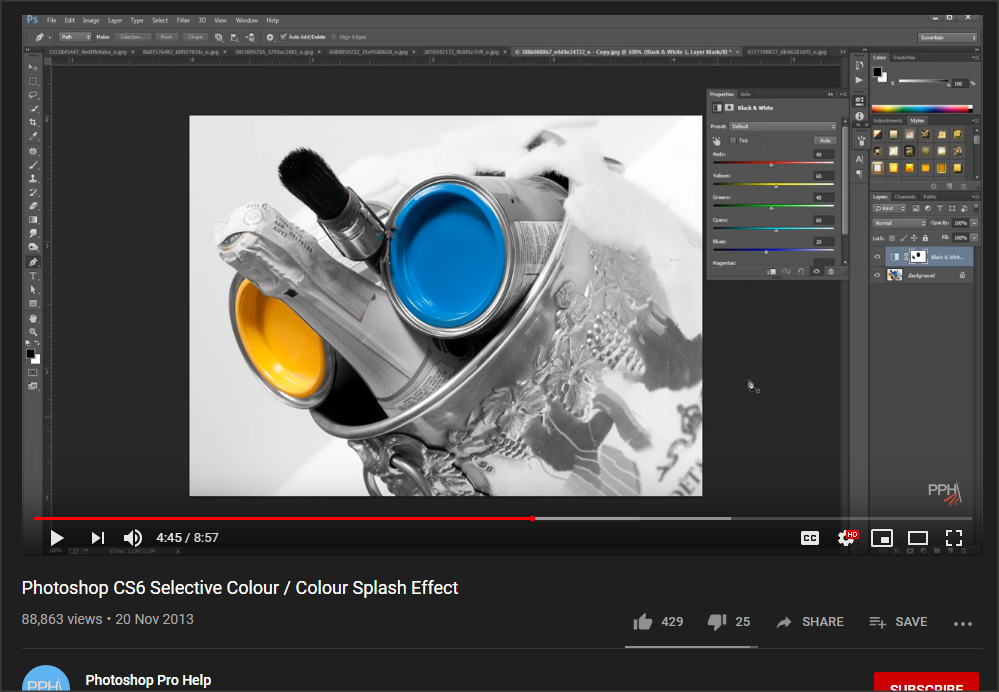
I used 'Selective Colouring' to highlight the distinct detail in the waves and waters glistening, reflection. I used the 'Colour Range' tool to select my area of interest, and using a black and white filter on top of it to create this image.
Best Picture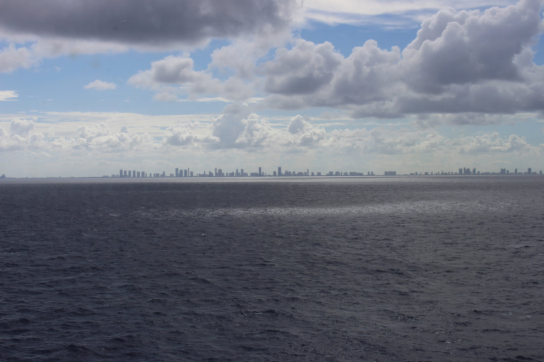
I think this is the best image as,
This is simply one of my favorite images , I've taken. It has light and dark, the coastline of Miami and the clouds protecting the city from the beaming South Eastern America Sun |
Worst Picture
I think this is the worst image as,
It's bland and has no real focus and or concentration points |
Shoot 6- River in Miami(America v1)


Best Picture
I think this is the best image as,
It has an effective use of the Rule of Thirds, it also has vibrant, clear colours |
Worst Picture
I think this is the worst image as,
Its blurry and not particularly showing anything nice |
Linking Paragraph
End of Year 10, me and my Photography class went on a trip, to Manchester City Center and Salford, Media City UK. Manchester has a lot of canals and rivers, especially in these areas. It also has a lot of tall and or under construction buildings, as it is a rapidly evolving into a modernized city. With a vast amount of culture, vegetation and ways to easily travel throughout the city. In this section you will see images of both vegetation and a rapidly modernizing city all in one, with new means of public transport, tall skyscrapers and construction sites. As well as, flowers, trees and canals. Ultimately two opposites living perfectly in harmony.
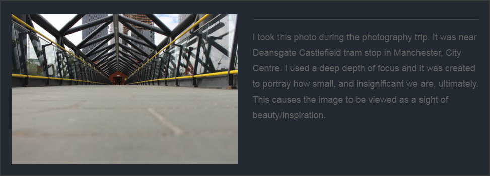
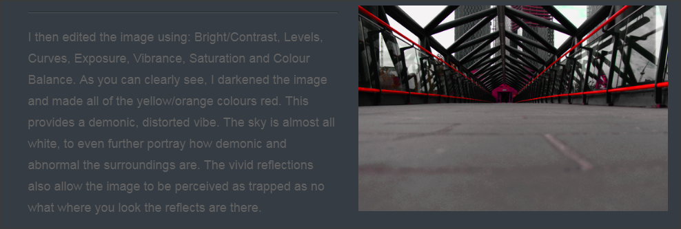
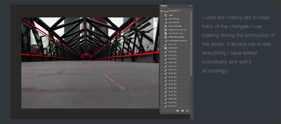
Shoot 7- Manchester Trip, Bridges


Photoshop Edits
|
|
Best Picture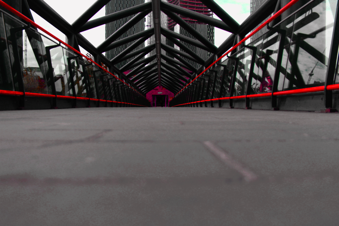
I think this is the best image as,
I used Photoshop to cause all the Yellow in he image to turn into a reddish, pinkish colour, it also has a deep depth of field and a variety of eye catching colours |
Worst Picture
I think this is the worst image as,
Its too bleached out, not in focus and generally just a poor image |
Shoot 8- Manchester Trip, Trams


Best Picture
I think this is the best image as,
The image has a wide range of view and a deep depth of field as everything is in focus |
Worst Picture
I think this is the worst image as,
It's not focus properly and doesn't have any interesting areas that'll pull in the viewer and cause it to be memorable |
Shoot 9- Manchester Trip, Depth Of Field


Best Picture
I think this is the best image as,
The image has a shallow depth of field and only the middle of the tree bark is in focus, moreover there's a vast range of colours and textures being displayed within the image |
Worst Picture
I think this is the worst image as,
This image doesn't present anything particularly nice its just a boring, blunt image with dull colours and no memorable or noticeable key features |
Shoot 10- Manchester Trip, Modern Buildings


Best Picture
I think this is the best image as,
I really like composition of this image, the building works as a mirror and reflects the sunlight and the vibrant blue sky. It also has a deep depth of field as all the image, despite being a reflect is clearly visible |
Worst Picture
I think this is the worst image as,
This image was meant to be a reflection, and it is very weakly reflecting the image. It is also extremely bleached out and doesn't have any focus points or memorable features |
Shoot 11- Manchester Trip, Old Fashioned Buildings


Best Picture
I think this is the best image as,
I love the lighting and and the traffic light being the main focus in this image. It also has a nice scaling affect |
Worst Picture
I think this is the worst image as,
This image is really random and has no purpose. It's not straight, its not got good lighting and it doesn't possess any important features |
Linking Paragraph
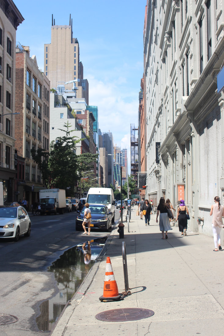
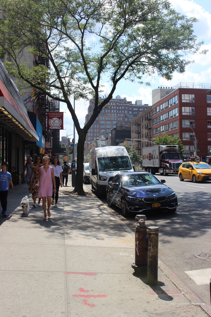
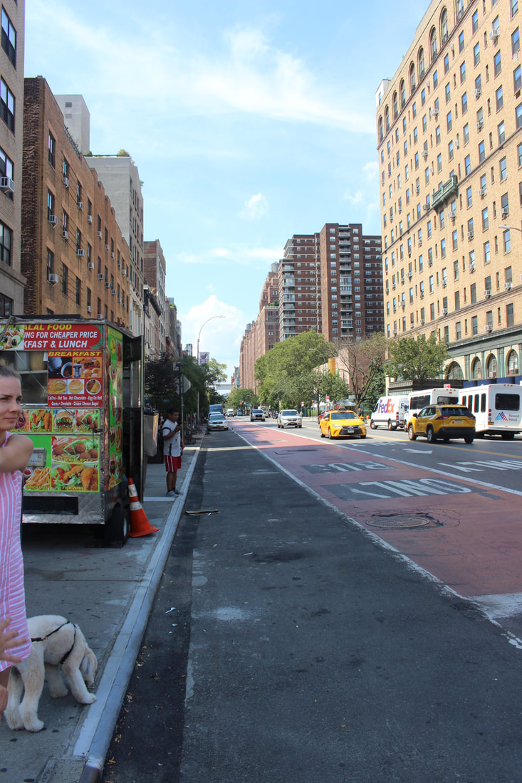
During the Summer Holiday 2019 (transition from Year 10-Year 11) I went on holiday to a number of locations such as: New York, Charlotte, Atlanta, Tampa, Miami and St Thomas. New York and Atlanta, have a rather modern and urban feel, with lost of tall builds and barely any vegetation. Whereas, Tampa, Miami and Charlotte were both urban and rural with loads of tall buildings and vegetation.
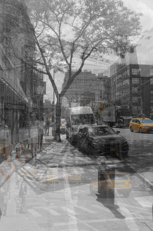
Shoot 12- American Signs(America v2)


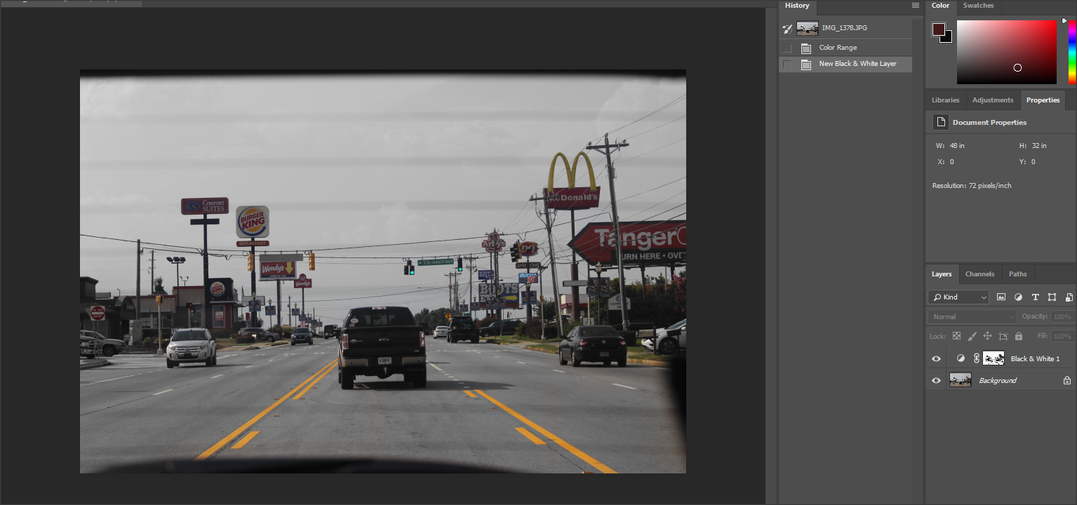
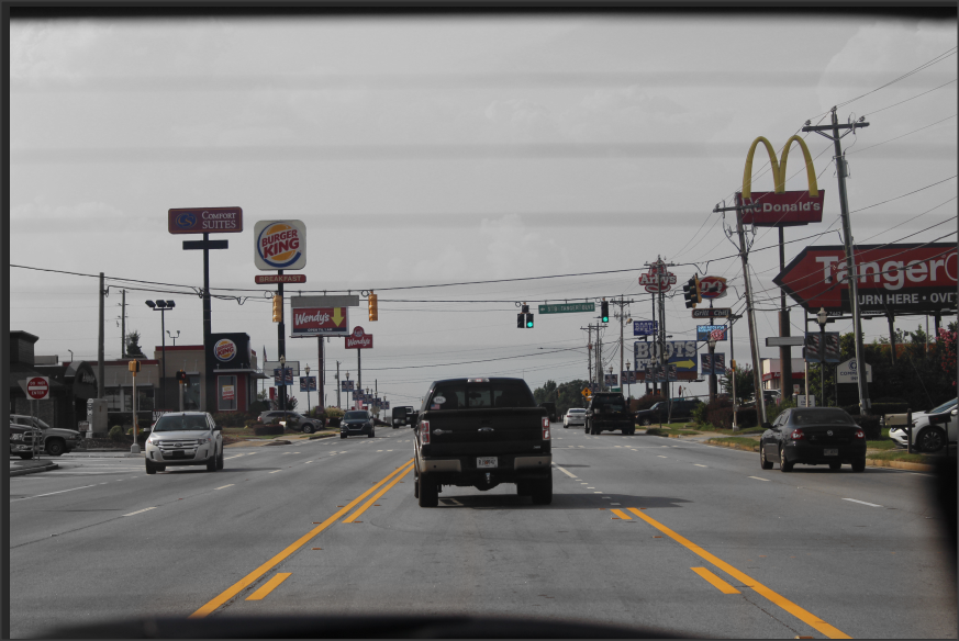
This is another example of 'Selective Colouring' it highlights the shop sign and the traffic signs, to try and show that American feel. I made the majority of the cars black and white, as well as the floor and the sky.
Best Picture
I think this is the best image as,
I love this image, it's a stereotypical American road with pickup trucks and shop signs all over, it also has a plethora of different colours, rule of thirds is also being used in this image |
Worst Picture
I think this is the worst image as,
This image similarly to the other has a stereotypical American road, but it just doesn't possess the same energy and memorable affect the others have |
Shoot 13- Nature, Clouds and Trees(America v2)


Best Picture
I think this is the best image as,
I like this image as the water clearly reflects the trees and light from above, it also has a nice vibrant background |
Worst Picture
I think this is the worst image as,
I strongly dislike this image as it's so random and pointless it doesn't possess anything remotely special or impressive |
Shoot 14- Park Shoot(America v2)


Best Picture
I think this is the best image as,
I really like this image as it has definition on the clouds and buildings, it also uses both Light & Dark to do this |
Worst Picture
I think this is the worst image as,
This image is massively bleached out and isn't straight and has no clear focus |
Shoot 15- Park Shoot, Hut(America v2)


Best Picture
I think this is the best image as,
|
Worst Picture
I think this is the worst image as,
|
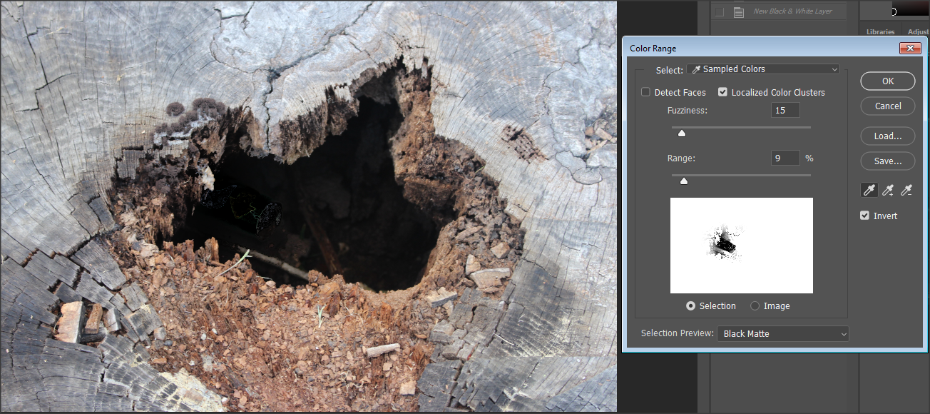
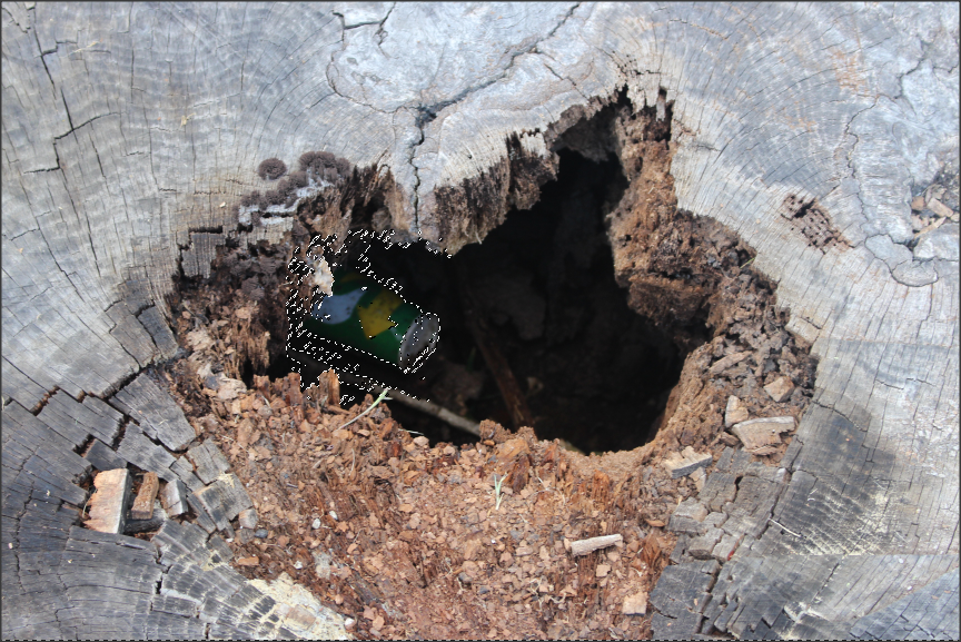
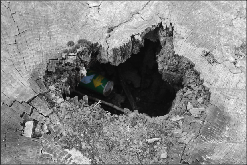
Shoot 16- Tree Trunk(American v2)


Photoshop Edits

|
|
|
I used 'Selective Colouring' to create this image and cause a specific item (in this case a subway paper cup) to be highlighted in the image to stand out from its maroon surroundings. I specifically used the Colour Range tool to highlight what I wanted to remain in colour whilst everything else turned black and white via a simple filter.
|
|
Best Picture
I think this is the best image as,
I like this image as it uses a shallow depth of field and has a nice sharp take of the bark |
Worst Picture
I think this is the worst image as,
This image isn't necessarily bad, it's just not focused |
Shoot 17- Car Window Pictures, some using Depth of Field(America v2)


Best Picture
I think this is the best image as,
|
Worst Picture
I think this is the worst image as,
|
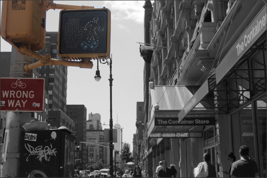
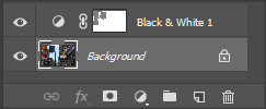
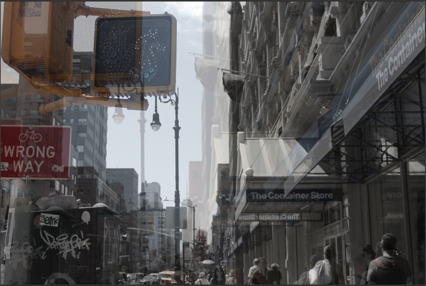
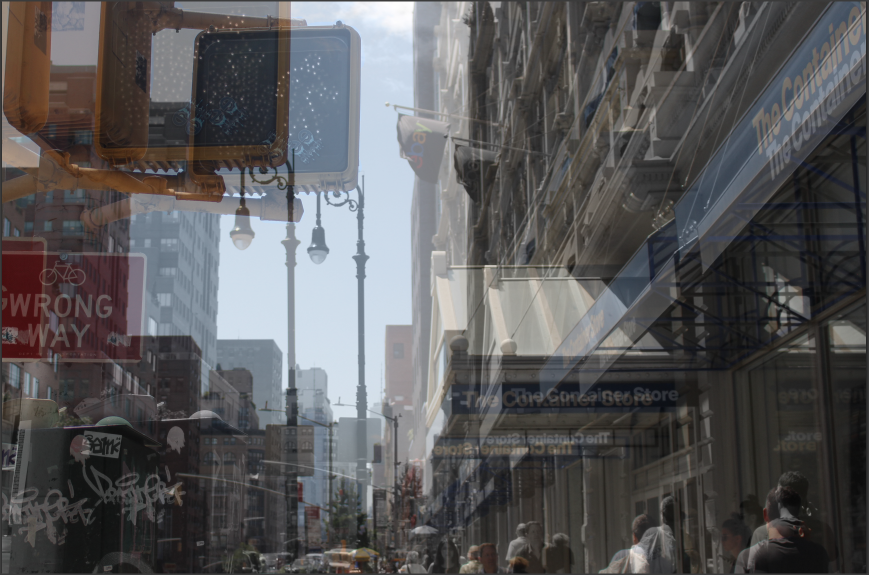
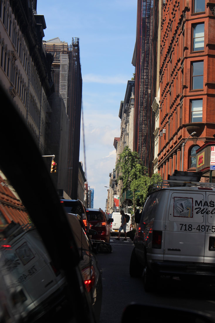
Shoot 18- Traffic Lights and Street Signs(America v2)


Best Picture
I think this is the best image as,
|
Worst Picture
I think this is the worst image as,
|
Shoot 19- Caribbean Sea with Islands(America v2)


Best Picture
I think this is the best image as,
|
Worst Picture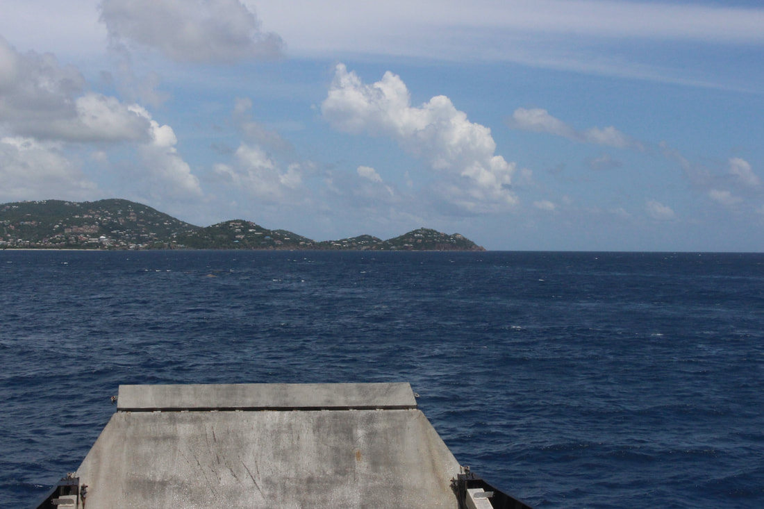
I think this is the worst image as,
|
Shoot 20- Caribbean Nature, Flowers, Trees, and Mountains(America v2)


Best Picture
I think this is the best image as,
|
Worst Picture
I think this is the worst image as,
|
Shoot 21- Top of The Island, Zip Wire(America v2)


Best Picture
|
Worst Picture
|
Shoot 22- Plane Shots, Caribbean(America v2)


Best Picture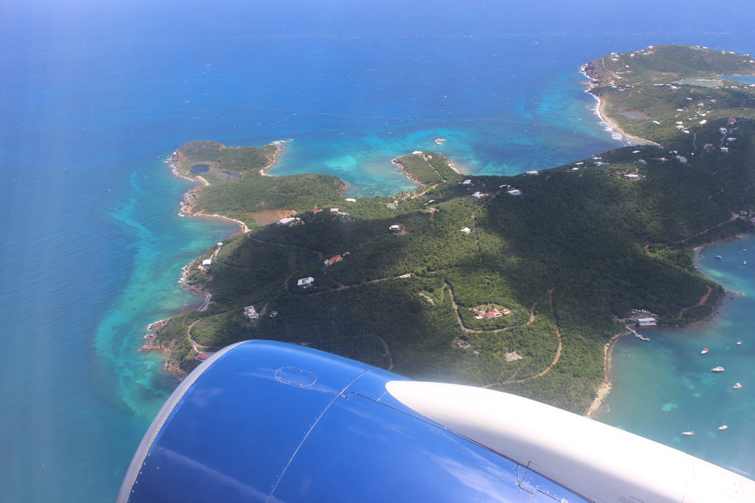
I think this is the best image as,
|
Worst Picture
I think this is the worst image as,
|
Shoot 23- Out of Car Window, New York(America v2)


Best Picture
I think this is the best image as,
|
Worst Picture
I think this is the worst image as,
|
Shoot 24- New York Street Photos (America v2)


|

|


Best Picture
I think this is the best image as,
|
Worst Picture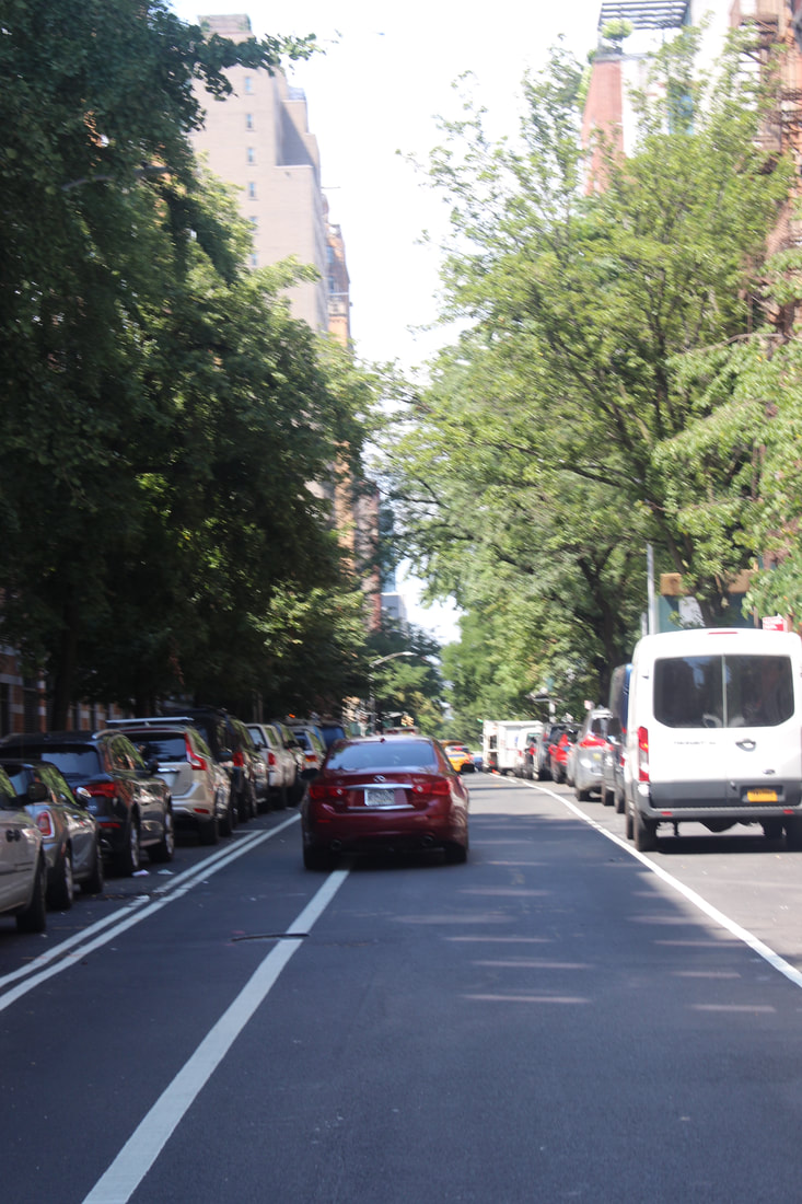
I think this is the worst image as,
|
My Themes are, Multi Exposure(Layering) , Manipulation of an Image and Colour in Landscape. I am going to be using Adobe Photoshop as my Software.
|
The Photographers I am basing my work off of are: Stephanie Jung, Alessio Trerotoli, Francesco Paler, Michael Kenna, Thomas Struth and Nicholas Goodden. I am taking most of my inspiration from Stephanie Jung, and her multi exposure via use of layer work. I am specifically inspired by this image, due to the vast colour variety and how it allows the picture to come alive. Furthermore, I will attempt to replicate/recreate this. I will watch a tutorial and try to master the art of laying effectively. Below is the tutorial I'm using to base my work off of, and the photo I am going to use layering on to recreate Jung's work. |

Layering #1:
This is one of the first times, I attempted to use Layering and Colour Enhancement in one. It has filters on the original image as well as the layered, less visible image.
|
I used capacity to cause the background images (which are very similar) to be less visible, yet still effective in the image.
|
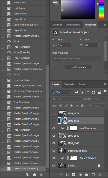
Layering #2:
|

|
|
|
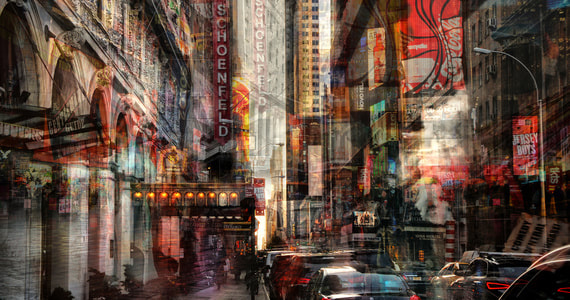
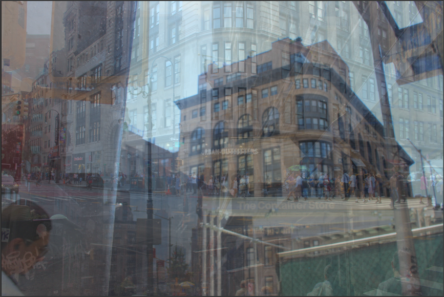
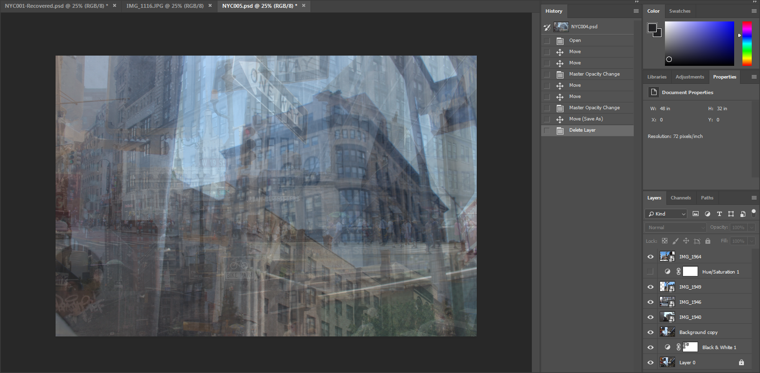
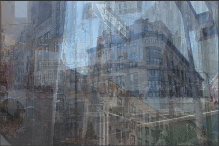
This piece of work is taken in NYC, it also has use of Layering and Colour Enhancement. This image has enlarged images, duplicated images and a use of filters. I prefer the dark eerie images as it creates a sense of mystery as to who the women is and why she is being highlighted/mainly focused in the image.
Multi Exposure Layering & Selective Experiment #1
|
|
These two videos are where I learnt how to do these Techniques, in this section I am going to attempt to combine both techniques.
When I learn how to do collages, or postcard type images I will combine the skills yet again.
When I learn how to do collages, or postcard type images I will combine the skills yet again.


I used these 3 images to create a final piece which uses both Multi Exposure Layering and Selective Colouring
Journey With My Work
|
|
|
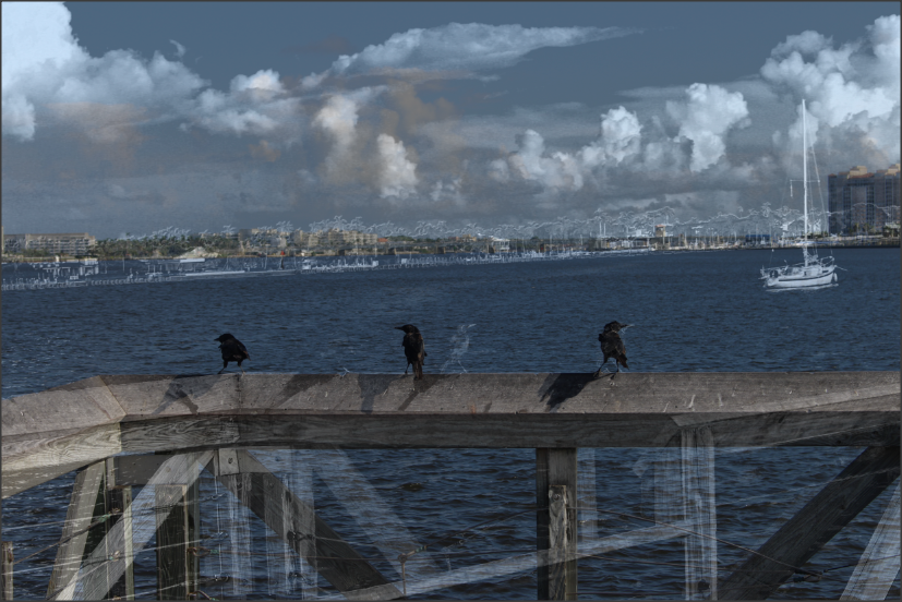
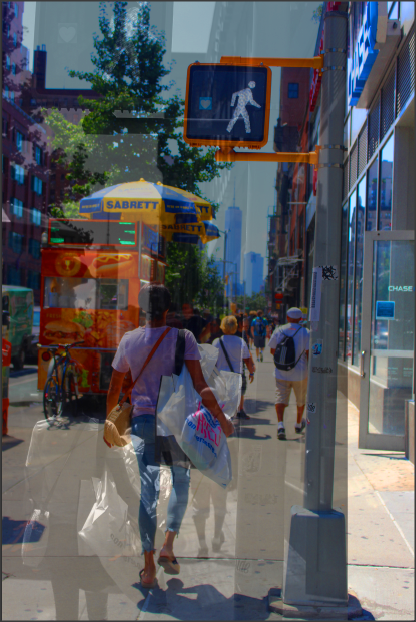
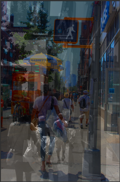
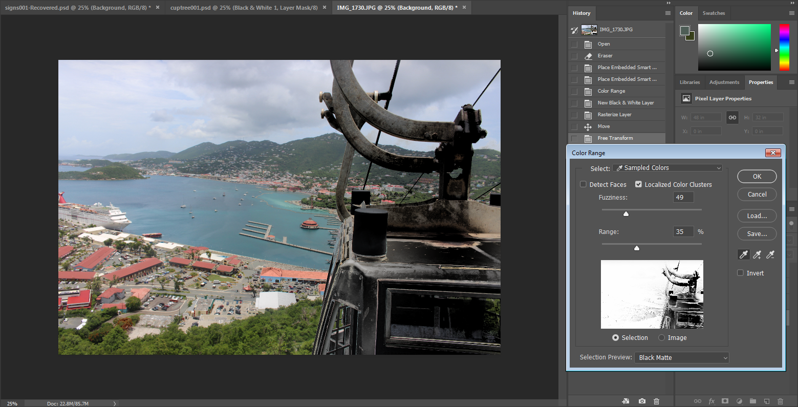
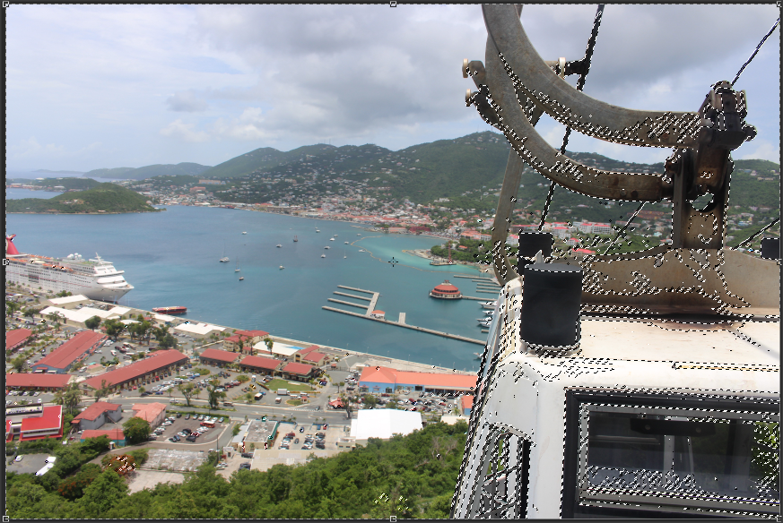
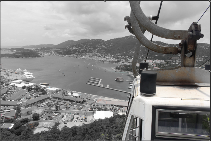
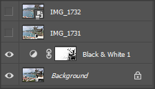
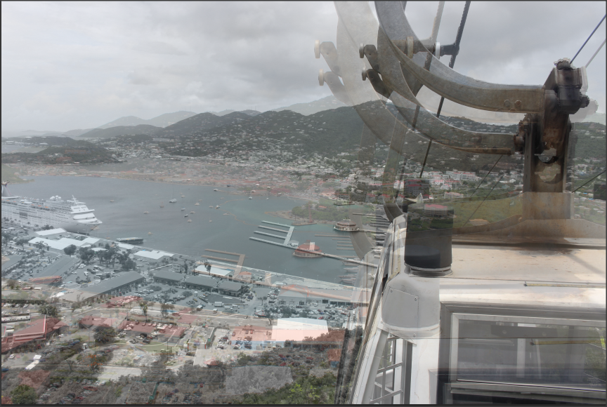
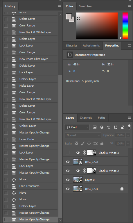
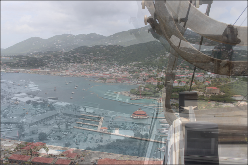
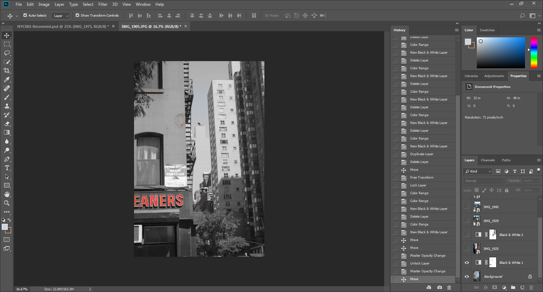
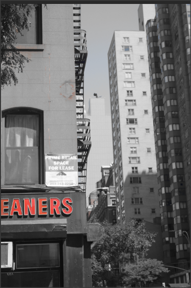
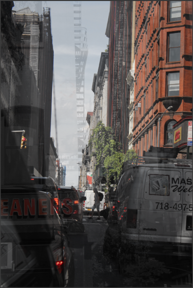
At this point in my work, I used 'Selective Colouring', the 'Colour Range' tool, Filters and Layering. This list of techniques and tools helped to provide the image so far, and a big factor in the finished piece. This image was taken in the US Virgin Islands (Caribbean). It gives off a sense of purity and adventure, as being on heights such as this will cause excitement and mystery. I am using multiple images which step by step will be uncovered, and manipulated to create the perfect/best piece.
|
|
Multi Exposure Layering & Selective Experiment #2


I used these 5 images to create a final piece which uses both Multi Exposure Layering and Selective Colouring
Journey With My Work
|
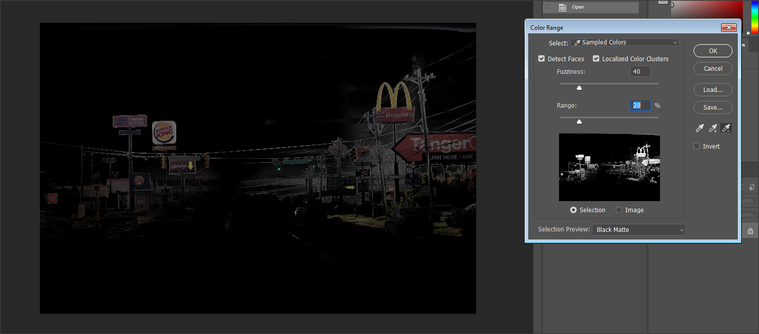
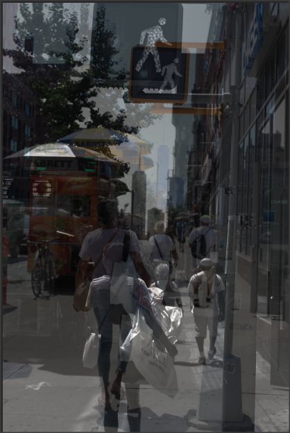
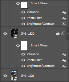
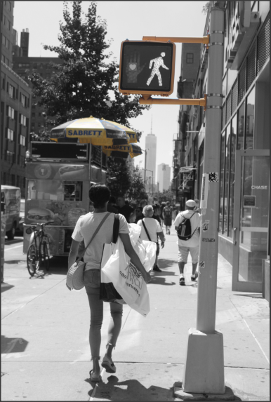
The use of the 'Eraser' tool was used when I put a filter on the first image, causing it to become Black & White. Afterwards, it uncovered the colour from the locked Layer and shows the areas I specifically use the tool on. This is a technique called 'Selective Colouring'. I also attempted to use 'Colour Range' to do 'Selective Colouring' but it wasn't identifying the areas i wanted it to, therefore I used the 'Eraser' tool.
|
|
|
|
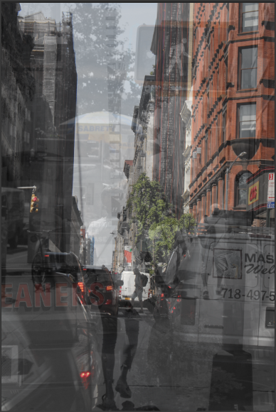
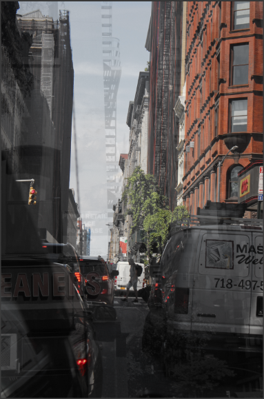
I then duplicate the Layer and caused it to overlap, with a Lower Capacity. Turning it into 'Layering'. The second image doesn't have a 'Black & White' filter so colour is seen specifically in the sky. This creates a contrast and causes the image to be more 3D.
I then added to images and changed the Capacity to cause them to be less visible and to create more of an image. At this point there's 4 images involved. All with Filters and 'Colour Enhancement', this creates slight differences in each image and different levels to cause it to look more alive (3D). This isn't quite the finished result, but it's a prime example of various layers being used to do the technique, 'Layering' effectively.
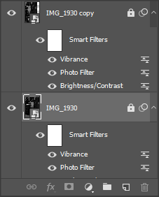
This is the final image, it has 5 individual, unique images and 6 layers. All with different levels of capacity and and different Filters. I used 2 primary factors 'Selective Colouring' and 'Layering'.
Multi Exposure Layering & Selective Experiment #3

|
|
|
I used these 3 images to create a final piece which uses both Multi Exposure Layering and Selective Colouring
Journey With My Work
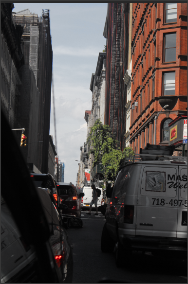
I began with the 'Colour Range' tool, which highlighted the red writing on the building. Afterwards I turn the rest of image black and white, effectively leaving the only colour on the image to be the red writing, this is an example of 'Selective Colouring'.
|
|
I then went to the second layer and used the 'Colour Range' tool on it to select parts of the image, causing it to turn Black & White, yet again using Selective Colouring. Moreover, I made the bottom layer visible (it has 100% capacity) and lowered the capacity of the second layer to about 75%, still causing the background original image to be visible
|
|
Thirdly, I moved to the third layer where I did Selective Colouring using the tedious and extremely long method, due to Colour Range being inaccurate and highlighting the wrong pars of my work. I simply, went on filters turned the image Black & White, and manually erased all the colour off of the traffic light the yellow parts of the umbrella. Effectively any part of the image that possessed a bright yellow.
|
|
|
|
|
Lastly, I made all the prior images visible and I lowered the capacity of the third and final image to 50%. There was a problem though. The Colour Range, Black & White filters overlapped the other images (as you can see in image 2) and discoloured the purposely coloured areas. I had to merge the first to layers to overrun the filter to create the first image.
|
|
Multi Exposure Layering & Selective Experiment #4
|
|
|
|
Final Gallery (1-15) Images
|
|
|
|
|
|
Mock Exam Evaluation 12.12.19
During the production of my Landscape Project, I've had various themes such as: Urban Areas and their advanced civilizations, Rural Areas and the beauty within them and Plane Window/Car Window Photography. I used a vast amounts of themes to show my strengths and weaknesses in my work. My favourite theme was, Rural Photography as it shows the beauty in nature and it was relatively therapeutic.
I found the use of Photoshop the most interesting as, it is extremely relaxing and there's endless opportunity with the software. It is somewhat astonishing the fact every and anything can be created or drawn via Photoshop. On Photoshop I have learnt quite a few techniques, but my favourite ones are: Selective Colouring and Layering. I have become moderately advanced at these techniques, to the point where I can combine them and use them and execute them perfectly. I would want to learn, Image Manipulation, where something could be bent or discoloured or even like transformed,it is quite an advanced skill, I'm comparatively intrigued to learn.
Throughout, my Photoshop endeavors I have done research on the following Photographers: Stephanie Jung, Alessio Trerotoli and Nicholas Goodden. Partly basing my work off of there's and using certain styles and procedures they previously used. The majority of them are famous for Layering, but few are famous for they're Selective Colouring work. Although non of them (as far as I know) have combined the two methods together I still adapt they're style into my own.
I think the most successful part of my project was, the 'America V2' shoots, as they had a plethora of different images and environments causing them to be diverse, but yet quality images. Despite, encountering a common problem, I had too many images. So I had to slim down my galleries a number of times, to make them powerful and increase the quality of work I was producing. If I had the opportunity to do this project again I would take more meaningful pictures, that could later be taken further in Photoshop. I would also get a bigger variety of Photos to further display my advanced Photography skills.
My final outcomes consist of two techniques, Layering and Selective Colouring. There are Layering images by itself with no other techniques or adaptions. The Selective Colouring images are always combined with Layering, as Selective Colouring isn't the most complex technique and only using it I will not be able to acquire the high grades I know I can achieve. Using dual techniques in Photoshop can get rather messy and quite complex to keep separate, until the piece is finished. Furthermore, the final outcomes the further you go down get stronger and stronger, hopefully it will solidify a high mark.
